
PROJECT 10/16
Role
Art Direction
Concept Development
Visual Design
Creative Fields
Visual Identity
Branding
Content Creaton
Webtool
Extra
🏆 Silver Award at the 2016 International Visual Identity Awards
🏆 Finalist at the Hiiibrands Award 2017
Brand
De Tekstbrouwmeester is a company that writes high quality texts for all sorts of clients. Their texts are so well written that they can 'capture the imagination'.
Project
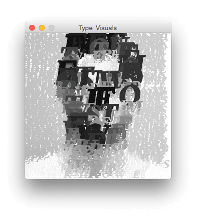
A so called programmatic visual identity was designed, which enables this company to create distinguished content with their own written texts.

Hobart Reese, who made portraits of famous people in 1922 only using a typewriter, was the inspiration for this identity. The fundamental idea is only using letters to make images. By repositioning them using different sizes, colours and positions, text is not only text anymore but it also becomes an image.
Therefore, a picture is literally worth a thousand words!


Content creation is becoming more and more important. For a company a website, Facebook cover photo or the back of their businesscard are examples of where they can show their branding.
Therefore a webtool was created with which De Tekstbrouwmeester can create content themselves.


The tool consists or primary and secondary controls. The primary controls are uploading an image, importing a self written text and saving it as a (vector based) PDF.
With the secondary controls you can adjust the min and max letter size, letter size range, line height, letter spacing and choose between color or black&white.


The visuals created with the tool can be used in offline and online means of communication.


Another briljant inventor, Johannes Gutenberg, was the first to use 'movable type printing' in 1439. He did this by splitting text into it's individual components, such as lower and upper case letters. De Tekstbrouwmeester will be the first to make 'programmable movable type visuals'!


Let’s start a 📂 together
